
-5d825e57ca7d8.png)


How has colour played a part in lockdown?
Posted 6 years ago by The Glass Wipe Board Company Team
Have you ever visited a company website, watched their ad or visited their social media and have instinctually known they’re not the right brand for you?
This could all be down to the colours they use.
We’ve been speaking to colour expert Karen Haller in our podcast, Colour Surgery, about the use and power of colour. Karen explains “colour influences how we think, how we feel and how we behave”, but “we don’t realise that we are responding [and] reacting to colour that is around us all the time, we are only about 20% conscious of that”.
Although we may not be consciously aware of our reactions to the colours we see every day, sectors such as advertising and marketing utilise colour to create an aesthetic that will complement their message and encourage us to feel a certain way about their brand.
“colour influences how we think,
how we feel and how we behave”
How important is it for a brand to choose the ‘right’ colour that matches their brand values and company messages? “If those words and what those words are saying isn’t giving the same message as what the colours are saying, we instinctively don’t believe the brand’s message”, Karen explains “Any colours that you go with […] this conscious and subconscious message must be in alignment, because when it’s in alignment, we understand”
We see this alignment of colour and message within the images for the COVID-19 Government guidelines. The use of bright, strong colours to emphasis their message is actually very simple, “Yellow and Black […] to us is typically a warning sign” Karen says, it encourages us “to be alert and to pay attention” when paired with the red banner, making the ‘Stay Home’ message very clear.

However, the Government also provided us with a great example of when colour and the message doesn’t align. The introduction of Green within the ‘Stay Alert’ message may be the reason why so many people felt confused by the instructions, and why some believe the lockdown was ‘over’. “I think what they tried to do was the traffic light system, so red is stop, stop pay attention. What they should have gone to next was orange” Karen explains, instead “they jumped straight to green with an orange message”.

Because we take in colour before words, it’s likely we took in the green from the message before we took in the words of the message, “green for us means go, why do you think everyone started going?” Karen explains, “we were told to go because the green told us to go. That’s the power colour has on us”
"green for us mean go, why do;
you think everyone started going"
Colour in advertising has a big impact on us as consumers, but this impact is no different in our personal lives. We can encourage different behaviours and moods in ourselves, through the use of colour; Karen tells us “if there’s a colour that you’re attracted to, just go with it, even if you don’t know what it means or why”, starting small “you can do it in the way of plants, you can even do it in the way of food or something inexpensive like tea towels”.
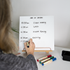
Introducing snippets of colour consciously, whether this be through cushions in your home office, or a bespoke colour glass wipe board in your office space, can promote positivity, productivity and increase your wellbeing.
Want to find out more?
To find out more about Karen Haller and how you can apply colour to your life, visit her website here, or to check out her book 'The Little Book of Colour' click here.
You can also find out more about our range of BowlPhish Glass Wipe Boards, available in our standard 22 colours – or a unique colour of your choice – to perfectly match your workspace and give you the colour boost you’re looking for.